「Glossy Button 1」は、光沢のあるボタンを生成するGIMPプラグイン。
このプラグインを使うには、GIMP用Pythonモジュールが必要である。
インストール
配布ページ:GIMP Plugin – Glossy Button 1
「glossy_btn_01.zip」をダウンロードし、解凍。
解凍して出てきた「b&p_glossy_btn_01_v1.2.py」ファイルを、plug-ins フォルダに入れる。
plug-insフォルダは、Windowsの場合、「C:\Users\ユーザー名\.gimp-2.8\plug-ins」である。
GIMPを再起動する。
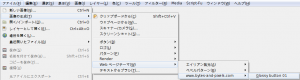
メニューの「 ファイル ≫ 画像の生成 ≫ Webページテーマ ≫ www.bytes-and-pixels.com 」内に、「 Glossy button 01 」が追加されていれば成功。
「Glossy Button 1」の使い方
「 画像の生成 ≫ Webページテーマ ≫ www.bytes-and-pixels.com 」内の、「 Glossy button 01 」をクリックし、「python-fu-Glossy_Button_01」ダイアログを呼び出す。
「python-fu-Glossy_Button_01」ダイアログ
- Button Width
ボタンの幅。
- Button Height
ボタンの高さ。
- Corner Radius
角の丸みの半径を指定。
「0」を指定すると、丸めない。
- Shadow amount
影の量を指定。
「0」を指定すると、影を描かない。
- Color
ボタンの色を指定。
- Add Text
ボタンに、テキストを追加するか、しないかを選択。
- Text Size(px)
テキストのサイズを指定。
- Text
ボタン上に描くテキストを入力する。
- Font
ボタン上に描くテキストのフォントを指定。
- Text Color
テキストの色を指定。
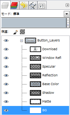
- Flatten Image
テキストや影や反射などのレイヤーを結合するか、しないかを選択。
「する」を選択すると、1つのレイヤーに結合する。
「しない」を選択すると、テキストや影や反射などを個別のレイヤーに出力する。
- Generate Button States
マウスオーバー時と、クリック時のボタンを生成するかしないかを選択。
「する」を選択すると、マウスオーバー時と、クリック時のボタンも、別画像に生成する。
Flatten Image
「python-fu-Glossy_Button_01」ダイアログの「Flatten Image」を「しない」で適用すると、テキストや影や反射などを個別のレイヤーに出力する。
「Glossy Button 1」による生成例
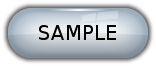
初期設定値で適用。
- Button Width: 200
- Button Width: 100
- Button Height: 100
- Button Height: 25
- Corner Radius: 0
- Corner Radius: 24
- Shadow amount: 0
- Color: Red
- Add Text: しない
- Font: ElephantItalic
- Text Size: 10
- Text Color: 赤
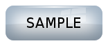
「Generate Button States」を、「する」に指定し生成した時の、マウスオーバー時用のボタン画像。
「Generate Button States」を、「する」に指定し生成した時の、クリック時用のボタン画像。